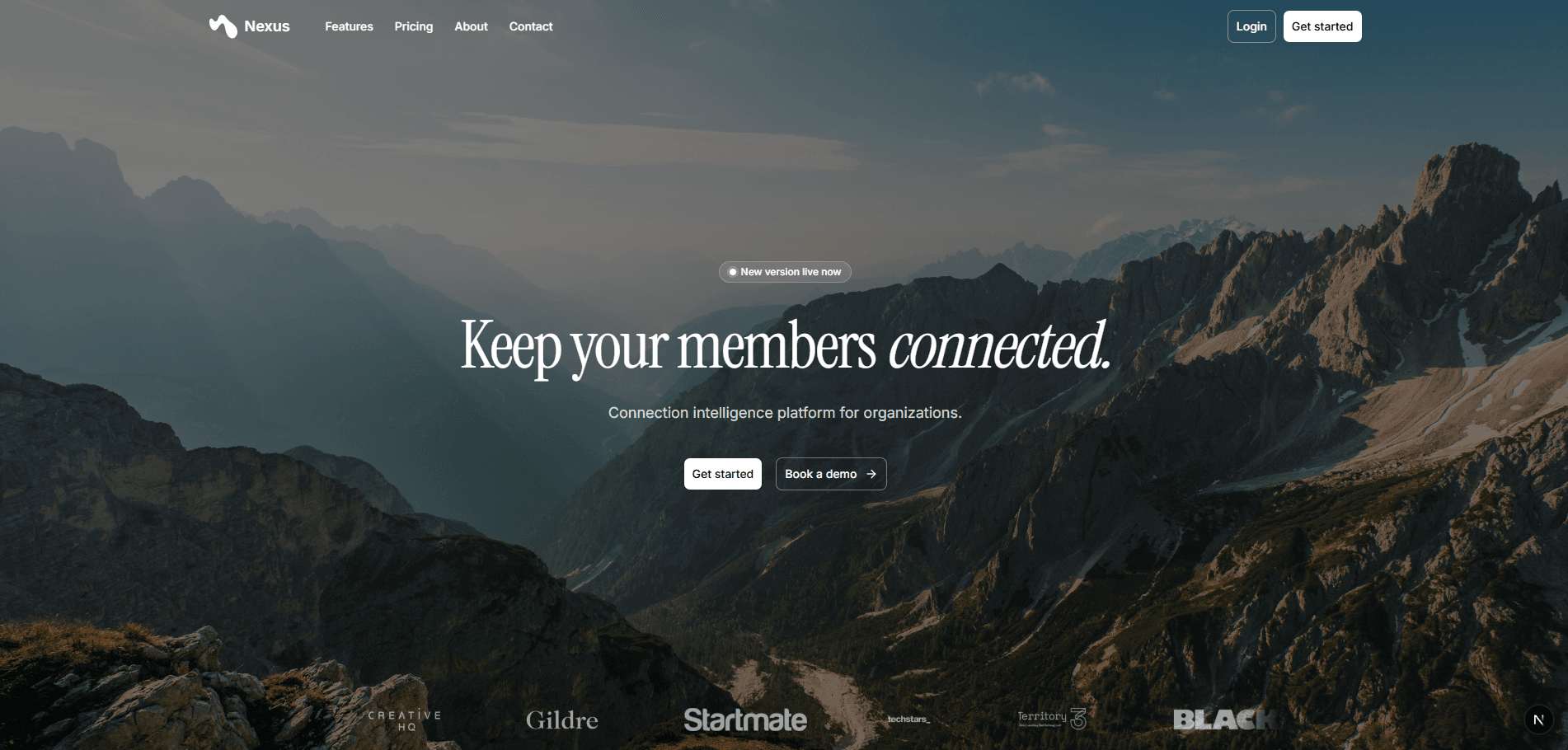
Nexus
Onboarding took 25 to 30 minutes and read like a survey. Users started it and did not finish. I owned the problem for 12 weeks, from the analytics that surfaced it through the design that replaced it.





Snapshot
- Role
- Product Manager Intern
- Client
- Connection intelligence AI platform, Austin
- Timeline
- June 2026 to August 2026, 12-week program
- Team
- Myself and one engineer
- Status
- Shipped
- Scope
- Onboarding experience, end to end
- Stack
- Next.js, React, TypeScript, shadcn/ui, Clerk, Figma
The Problem
Onboarding took 25 to 30 minutes and read like a survey. Users started it and did not finish.
The flow asked people to type in information the product could have retrieved on its own. It also gave no indication of how much was left, so a user 15 minutes in had no way to tell whether they were nearly done or barely started.
A connection intelligence product is worth nothing until it knows who you are connected to. Onboarding is where that information arrives. A user who abandons the flow never reaches the part of the product that works, and the company never learns whether the product would have worked for them.
Discovery
Product analytics showed high starts and low completion. The shape of that data narrowed the problem before I touched anything. If acquisition were the issue, starts would have been low. Starts were fine. People were arriving, beginning, and leaving partway through.
That pointed at the flow itself rather than at marketing or positioning. I walked the onboarding as a new user, timed each step, and wrote down where the work actually sat.
Most of it sat in fields the user had to fill in by hand. The rest sat in the absence of any signal about progress.
I also went through the fields themselves and grouped them by whether the product could have answered each one without asking. That grouping became the argument for the first change, because it showed how much of the 25 minutes was avoidable rather than necessary.
What I Found
Length was part of the cost, and it was not all of it. Users had no visibility into progress and no reason to believe that finishing was close. A long form with no progress signal reads as unbounded, and people leave unbounded tasks.
Manual entry compounded it. Every field a user typed by hand was a field where they could stall, and much of what they were typing duplicated information already sitting in accounts they had connected during signup.
So the flow was asking users to do work the product was already capable of doing, and giving them nothing in return for the effort. Both halves had to change for either to matter.
The two failures reinforced each other. Manual entry made the flow long, and the missing progress signal made the length feel unbounded. Fixing one and leaving the other would have left the drop-off largely intact.
Decisions and Tradeoffs
I made three changes.
The first replaced survey-style manual entry with automatic profile scanning from synced Google Workspace and LinkedIn accounts. The product already had permission to read those accounts. Asking a user to retype what the system could retrieve spent their patience on work the software should have been doing.
The second added a progress indicator. This was the cheapest of the three and it addressed the belief problem directly. A user who can see four steps remaining behaves differently from a user staring into a form with no visible end.
The third added a guided in-app tour and a redesigned login page. Onboarding does not end at the last form field. A user who completes setup and then cannot find the feature they signed up for has not actually been onboarded, and the completion metric would have hidden that.
I considered splitting the flow into a short required section and a longer optional one that users could finish later. I set it aside. Splitting would have improved measured completion time while leaving profiles half populated, which pushes the problem downstream into a product that returns worse matches. The goal was a complete profile that took less time to produce, not a shorter form.
I also set aside a full redesign of the post-onboarding dashboard. It sat outside the problem I had been given, and widening the scope would have delayed the fix for the thing that was measurably losing users. Twelve weeks is enough to do one thing properly.
Execution
I owned the onboarding experience end to end across the 12 weeks: the problem definition, the proposed design, and the system behind it.
One engineer built the Google and LinkedIn syncs. I wrote the specification for what the syncs needed to return and which fields they would populate, so the design and the integration could be built in parallel rather than in sequence.
Working with one engineer against a 12-week clock made sequencing matter more than scope. I wrote the sync specification first so the integration could start while the flow design was still moving, which is the only reason all four pieces shipped together.
What Shipped
The redesigned onboarding flow with automatic profile scanning, the progress indicator, the guided in-app tour, and the new login page.
All four went out together at the end of the program.
Results
Onboarding completion time dropped from 25 to 30 minutes down to 10 to 15. Signups rose roughly 20% after launch.
The 20% figure is directional. It comes from the company's own analytics over the period following the release, and I did not isolate it from anything else happening at the same time.
Completion time is the number I trust most here. It was measured the same way before and after, on the same flow, with the same instrumentation.
What I Would Do Differently
Ship the three changes as staged releases rather than as one. Because all three went out together, the lift can be attributed to the set but not to any individual change.
Staging them would have cost a few weeks and produced an answer about which change carried the result. That answer is worth more than the weeks, and without it the next team to touch this flow has to rediscover it.