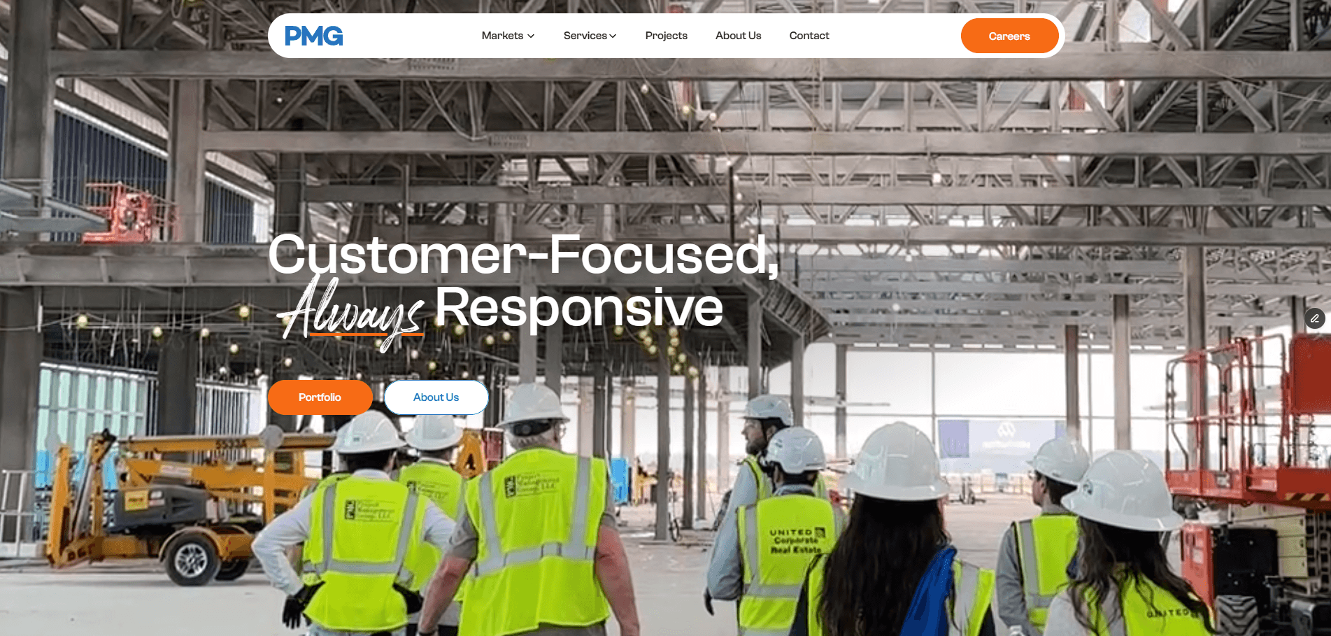


The situation
The old PMG website looked two decades out of date, to the point that a visitor could reasonably wonder whether the firm was still operating. In public-sector AEC, that is not a cosmetic problem. Clients select firms they believe are innovative and future-proof, and peers like Turner, AECOM, and Jacobs present online as firms with resources.
The site was working against the firm's own positioning. Projects were represented incompletely and sometimes incorrectly, and navigation made the work hard to find.
The stakeholders and what each wanted
The redesign had four internal stakeholders pulling in different directions. The COO wanted a design-forward, heavily branded site, with consistent primary and secondary colorways and the Think PMG identity throughout. The CEO wanted projects easy to find, with clear statistics a client could extract at a glance. Marketing owned brand voice. The project managers owned the technical accuracy of every project page.
The tension was structural. Brand promotion and technical precision pull against each other in the same paragraphs, and both groups were right about what they needed.
The design position
I took a position that not everyone expects from a redesign. In construction, good design is the kind you do not notice, because it serves navigation rather than expression. The job was to get out of the user's way. Find the sector, find the project, understand what happened, read the stats. Restraint was the correct answer for the category, not a compromise.
What was built
The centerpiece is a filterable project section. A higher-education client filters to higher-education work and sees exactly what the firm has delivered, with per-project statistics including contract value and duration. The feature maps directly to the buyer's actual job, which is confirming that a firm has done work like theirs before.
The brand system resolved the stakeholder tension rather than picking a side. A secondary color carries a specific meaning, safety, which is core to the firm's values, and it complements the primary blue instead of competing with it. The whole site runs on a headless CMS, so the non-technical team maintains and updates content without touching code, which is what keeps the redesign from decaying back into the old state.
Constraints
There was no budget, so I designed and built it in-house. Brand consistency was a hard requirement, not a preference. And the content had to be reconciled across three groups who did not naturally agree: marketing for voice, engineers and project managers for accuracy.
Result
This is the only case study in the set with a measured outcome. After launch, site traffic increased, and the project pages specifically draw more traffic than they did before. The direction comes from site analytics. I am reporting the direction rather than inventing precise figures.